1.
Nice use of reflecting pool to get the mirror image of the dead trees. The lighting was not really managed well in this shot. The whole shot is greyed out and the mid-portion of the dead trees doesn't contrast with the trees in the background. The sky and mountains are too bright and could have benefitted from a graduated filter and post-editing. The shot itself is framed nicely. I would have been interested to see this shot taken from atop a tall tripod looking down into the pool with less sky.
2.
This photo really pushes the boundary of what is/isn't 'nature' photography. The way the photo is laid out with the walkway in the foreground protruding into the center of the picture, to my mind, makes it the focus of the shot. It is about the only thing in the shot that is in focus. The mist just beyond the walkway over the pool is would be a better focus point for this shot.
3.
I like the odd angle that he uses here. It's not verticle in either axis. It really makes a strong mood statement and makes the trees seem more imposing. The frost on the trees really makes them stand out too. I think this shot taken from the ground could have really taken made this shot even more striking by adding an extra six feet of depth under the canopy.
4.
I like the layers of cloudy skies over calm waters. The clouds have a natural striped effect that could be brought out with some editing. The shoreline is distracting with the slight right tilt. I would make sure to get the camera level or rotate it slightly CCW to level out the shot. The scene is excellent with the layering, slightly disturbed reflection and striated sky. A graduated filter could be used to darken the sky so that the mountains would pop a bit more.
5.
I am not a fan of post-editing on this level. The color palate is pushed into total absurdity! It isn't a real-to-life photo. In a word, I would call it cartoonish. Also the fact that the bridge sits on the upper 'third' line makes it a subject element of the shot. I would angle down in order to take the emphasis off of it for a nature shot. The trees' shadow on the water is a very intriguing element. Also this shot would be better from a few feet left to take the tree on the right out of the frame, either partially or completely. The gap between the right edge of that tree and the edge of the frame is distracting and doesn't take advantage of the tree for framing purposes.
6.
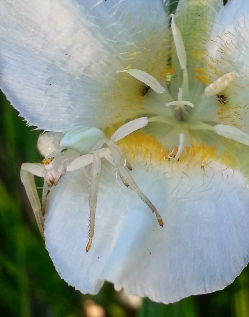
This is a very cool shot. Excellent detail of the spider and the flower stamen. I am impressed by the details you captured of all of the fine hairs on the flower and the spider. My only criticism is that the shot doesn't keep the whole petal that the spider is sitting on in focus. It gets fuzzy at the bottom edge. The white spider against the white flower could use some more contrast. Well done!
7.
This is a very interesting shot with the squirrel still and most everything else around it seeming to vibrate with the squirrel's nervous energy. It makes a bold statement about the squirrel and his world. Moving the squirrel in the shot to the upper left third of the shot might give it a better look. I do like it as is, though.
8.
I like the use of aperture to create the flare coming off of the sun in the silhouetted trees. I would have panned up and used the base of the branches as the bottom framing point in this shot. The big blue band of sky between the ground and the base of the tree branches becomes too dominant and takes away from the real subject, which is the sun and sun-flare. You have enough blue sky in the tree branches. The ground in the bottom of the frame adds nothing to your shot.
9.
This photo exemplifies the use of the rule-of-thirds and using natural elements in the shot to frame the subject. Here the bear is placed squarely on the lower left third and is framed in by the fallen log, pine tree trunk, and branches over the bear. The bear could be a little lighter. Excellent shot.
10.
This shot really captures the detail in this bison. I like that you really got the eye, horn and the fall coat. Positioning the camera up high on a high tripod might allow you to capture the bison, and take the grasses that are blocking your lower part of the bison out of the frame, while still allowing you to keep the detail and elements of the bison in the shot.
The End
Friday, December 6, 2013
Thursday, December 5, 2013
Final Photo Presentation
FINAL PROJECT!!!
These 30 Photos represent the bulk of my photography work and progress over the course of this semester. Each of these are noteworthy in some way. They are either a triumph or a lesson learned. Either way... Enjoy!
1.
2.
3.
4.
5.
6.
7.
8.
9.
10.
11.
12.
13.
14.
15.
16.
17.
18.
19.
20.
21
22
23.
24.
25.
26.
27.
28.
29.
30.
***********************************************************************************
2.
3.
4.
5.
6.
7.
8.
9.
10.
11.
12.
13.
14.
15.
16.
17.
18.
19.
20.
21
22
23.
24.
25.
26.
27.
28.
29.
30.
| # | Camera | Lens mm | F-Stop | Exposure Time | ISO | Mode Priority | Flash |
| 1 | Samsung-SGH-I747 (S3) | 3.7 | 2.6 | 1/100 | 125 | Aperture Priority | No |
| 2 | Sony DSC-HX9V | 4.28 | 3.3 | 1/1600 | 100 | iPanarama | No |
| 3 | Canon EOS Rebel T3 | 29 | 5.6 | 1/40 | 2000 | Landscape | No |
| 4 | Canon EOS Rebel T3 | 18 | 3.5 | 1/1600 | 640 | Shutter | No |
| 5 | Canon EOS Rebel T3 | 29 | 5.6 | 1/40 | 800 | Landscape | No |
| 6 | Canon EOS Rebel T3 | 29 | 5.6 | 1/40 | 800 | Landscape | No |
| 7 | Canon EOS Rebel T3 | 55 | 5.6 | 1/50 | 3200 | Landscape | No |
| 8 | Canon EOS Rebel T3 | 18 | 5.6 | 1/30 | 1600 | Landscape | No |
| 9 | Canon EOS Rebel T3 | 18 | 5.6 | 1/25 | 3200 | Landscape | No |
| 10 | Canon EOS Rebel T3 | 18 | 5.6 | 1/20 | 3200 | Landscape | No |
| 11 | Canon EOS Rebel T3 | 24 | 10 | 1/200 | 100 | Program | No |
| 12 | Canon EOS Rebel T3 | 55 | 8 | 1/160 | 100 | Program | No |
| 13 | Canon EOS Rebel T3 | 18 | 6.3 | 1/125 | 100 | Program | No |
| 14 | Canon EOS Rebel T3 | 75 | 7.1 | 1/1250 | 3200 | Shutter | No |
| 15 | Canon EOS Rebel T3 | 55 | 5.6 | 1/1250 | 3200 | Shutter | No |
| 16 | Sony DSC-HX9V | 4.28 | 3.3 | 1/250 | 100 | Landscape | No |
| 17 | Canon PowerShot A710 IS | 5.8 | 4 | 1/80 | Auto | Auto | No |
| 18 | Canon PowerShot A710 IS | 13.2 | 3.5 | 1/125 | Auto | Auto | No |
| 19 | Canon PowerShot A710 IS | 13.2 | 3.5 | 1/100 | Auto | Auto | No |
| 20 | Samsung-SGH-I747 (S3) | 3.7 | 2.6 | 1/1032 | 80 | Aperture Priority | No |
| 21 | Samsung-SGH-I747 (S3) | 3.7 | 2.6 | 1/1060 | 80 | Aperture Priority | No |
| 22 | Samsung-SGH-I747 (S3) | 3.7 | 2.6 | 1/718 | 80 | Aperture Priority | No |
| 23 | Canon PowerShot A710 IS | 17.2 | 4 | 1/400 | Auto | Auto | No |
| 24 | Canon EOS Rebel T3 | 205 | 5.6 | 1/80 | 1600 | Shutter | No |
| 25 | Canon EOS Rebel T3 | 205 | 5.6 | 1/40 | 3200 | Manual | No |
| 26 | Canon EOS Rebel T3 | 300 | 5.6 | 1/800 | 125 | Shutter | No |
| 27 | Canon EOS Rebel T3 | 300 | 6.3 | 1/320 | 100 | Temperature Map | No |
| 28 | Sony DSC-HX9V | 4.28 | 3.3 | 1/200 | 100 | iPanarama | No |
| 29 | Sony DSC-HX9V | 4.28 | 3.3 | 1/1000 | 100 | Auto | No |
| 30 | Samsung-SGH-I747 (S3) | 3.7 | 2.6 | 1/30 | 80 | Aperture Priority | No |
Tuesday, November 26, 2013
1. Long exposure time, high F-stop and low ISO. Overall the photo is a bit whited out on the clouds coming down the side of the ridge. In the center of the ridge there is a line created by some kind of glare. The hill in the lower right foreground is much brighter than the rest of the trees. The photographer could have use a filter to darken those areas.
2. The photo should have framed up the rocks better. The photo emphasizes the water which is blurred by the long exposure. The rocks and sky would look better with the rock placed on the bottom third line of the photo.
3. Jumping squirrel is a bit flat. Only half of the squirrel is in focus and the branch that the squirrel is about to land on is way out of focus. The background is mostly green except for a small spot of brown in the bottom left
Wednesday, November 20, 2013
Android in the RAW
The following story is notable as it will be the Second mobile OS (after Win Mobile on specific Nokia phones) to support taking photos in RAW. The advance will mean easier post editing and better color capturing in mobile photography. Apple iOS is not likely to follow suit for a long time if at all. Given that they are slow to change and RAW files take up a large amount of memory iOS devices do not have expandable memory.
Source code snippets open door for raw photos on Android via CNET
Wednesday, November 13, 2013
| Photo Credit: Spike Walker |
Thursday, November 7, 2013
Thursday, October 31, 2013
Wednesday, October 23, 2013
Wednesday, October 16, 2013
C - Shot
| Photo: Gabriel Morrow, NPS |
Wednesday, October 9, 2013
Tuesday, October 1, 2013
Class Photo Critique
1 - Canon 5D 400mm f/5.6 ISO250 1/2000s Av Priority -1/3EV
Fish is centered in the bottom right rule-of-thirds sweet spot
Fish & Bear are sharp while water is slightly blurred
Bear & Fish contrasts well against the clear water
2 - Canon 5D 17mm f/22 ISO100 1.6s Av Priority -1/3EV
Yellow color pallet (Yellows over Reds)
Water is blurred and isn't sharp
Water does provide path for the eye into and out of the picture
3 - Canon 5DII 17mm f/11 ISO200 1.3s Manual
Too much use of blur!
Good contrast in rocks against waves
No subject in center or rule of thirds
4 -Canon 5DII 85mm f/1.8 10s ISO100 Manual
Clouds in front of mountains look like smudges
Clouds take away definition from mountains
Not much of a foreground or good entry exit points
Could use more sidelight
5 - Canon 1DIII 28mm f/13 ISO200 HDR
Good use of the 6 planes
6 - Canon 1DIV 840mm f/5.6 ISO400 1/800
Bird is mostly yellow with a bit of red
Bird is centered, could benefit from following rule of thirds to give more flow through
Solid color background with blurred out plant directly behind in-focus plant - Well done
7 - Canon 7D 500mm f/4.5 ISO1600 1/320
Photo is very grainy
There is alot of digital noise in the picure
Does not use rule of thirds
8 - Nikon D4
Reds in the foreground and Yellow in the sky draw your eye to the sky first instead of drawing into the foreground as a good photo should
Moose is not in good focus and does not have good detail
Moose's body is facing away from the camera
9 - Canon 1DII 500mm f/8.0 1/500
solid backround
Subject is sharp and in focus
Hard to see what the bird has in it's talons could use more focus on the fish and less blur in the wings water
10 - Nikon D2x 12mm f/6.3 ISO200 1/400
Subject and scene are almost all white and greyish sky
Needs more contrast and definition
Rule of thirds for the foreground bear would help the photo flow
Wednesday, September 25, 2013
| Photo Credit Larry Mayer/Billings Gazette published by Supercubs.org |
This photo of a Piper Cub over a pool in Yellowstone dramatically exhibits the use of color pallets, jagged lines and other so-called rules of dominance. The vantage point is also featured in this shot. This photo won Best of the West 2011 contest awards.
Saturday, September 21, 2013
Photo Techniques
Though this piece is centered on automotive photography, the techniques are universal. The photographer Michael Alan Ross talks about the influence of HD TV and displays that are pushing a certain look in photography, and how to achieve that with some easy settings and post-production enhancements.
Though this piece is centered on automotive photography, the techniques are universal. The photographer Michael Alan Ross talks about the influence of HD TV and displays that are pushing a certain look in photography, and how to achieve that with some easy settings and post-production enhancements.
Thursday, September 19, 2013
| Photo Credit: Rolf Maeder / Rex Features via AP |
| Photo Credit: Rolf Maeder / Rex Features via AP |
Subscribe to:
Comments (Atom)


.jpg)


